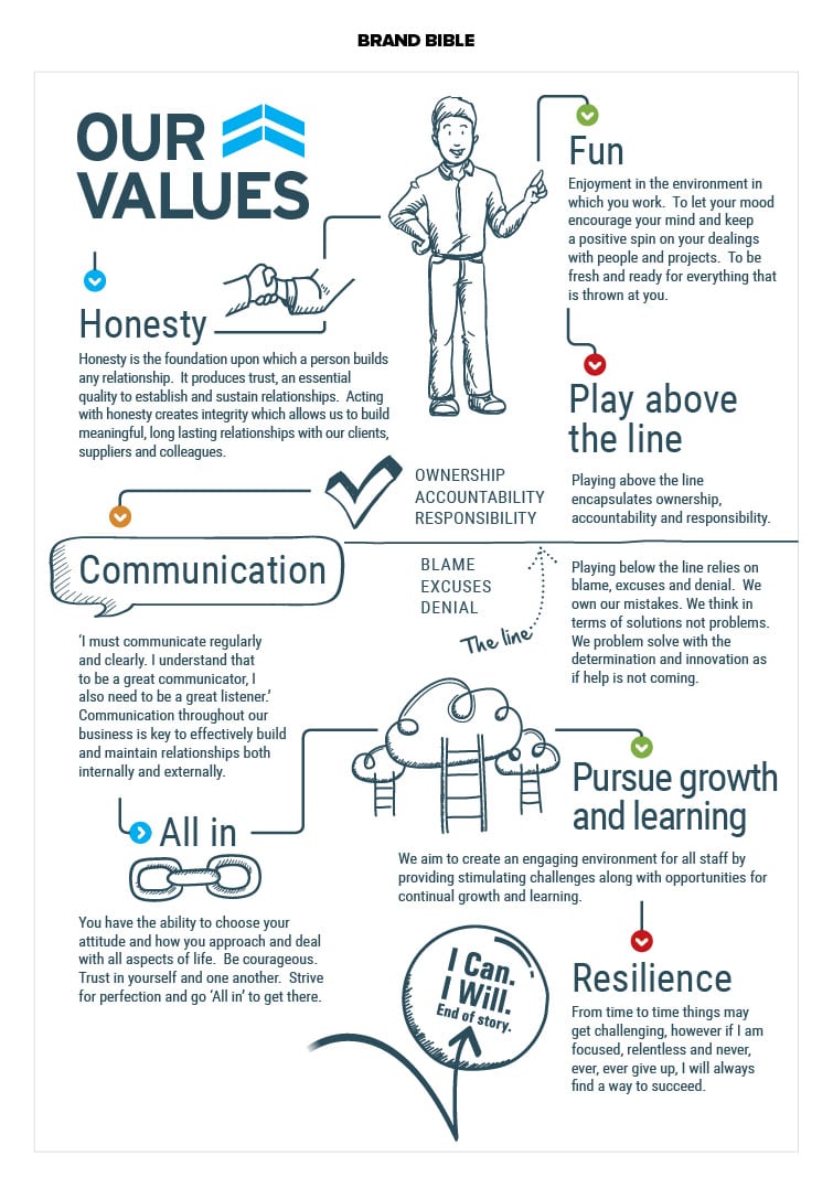
We created a strategic plan in collaboration with the owners of this exceptional company. It involved many preliminary meetings with the client to define the scope of work required before we went ahead. Once it was agreed that the Group would benefit from a strategic marketing plan we conducted a discovery with our partners Tucker Strategic and thereafter created the strategic plan to deliver on those outcomes and objectives we agreed together.
First up was to look at refreshing the logo. The client had built up some considerable brand equity in their years of operation and hence, we needed to retain the overall feel and key elements.
We refreshed this logo with the outcome of being more modern and reflecting the clients service offering more clearly. We went through a real discovery journey here presenting several typeface options and alternative custom geometrically drawn typefaces as well. The client was attached to their logo and the brand had been a great starting point that had built up a lot of equity. The 5 business owners had to be comfortable to change the logo at all as they loved their original logo. We feel like we delivered well on the outcome and set the brand up nicely for more compelling communication of the company story. In the end we settled on this custom drawn geometric font with the chevrons (arrows) integrated in a more cohesive manner with the typeface.
We have a great deal of upcoming projects to execute as delineated by the plan and look forward to continuing to work together with this young and industry leading company.
Watch this space for more creative.
The Creative


